

You spend hours editing a portrait in Adobe Lightroom or Photoshop on a calibrated 4K wide-gamut monitor. You craft luminous skin tones and rich cinematic contrast. But the moment you export and view it on a smartphone or upload it to social media, a nightmare unfolds: the image turns muddy and desaturated, and smooth shadow gradients crumble into ugly color banding. Your camera isn’t broken, and your editing skills aren’t to blame. You’ve fallen into one of digital imaging’s most insidious traps: the **Color Management Disaster**. This guide breaks down the physics of sRGB, Adobe RGB, and Display P3 color spaces, demystifies ICC profiles, and provides a bulletproof commercial export workflow to preserve your color dignity.
1. The Gamut Container Myth: sRGB, Adobe RGB, and Display P3
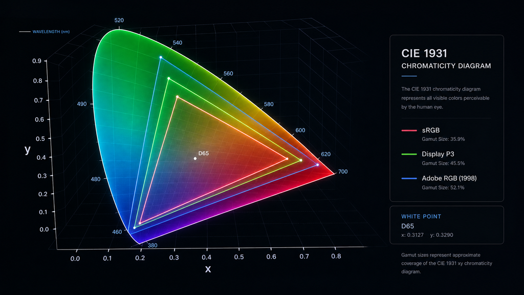
To solve color shift, you must first understand **Color Gamut**—the total range of colors a device or file format can mathematically represent. Think of different color spaces as liquid containers of varying sizes:
| Color Space | Gamut Capacity & Characteristics | Primary Use Cases |
|---|---|---|
| sRGB | The Small Universal Cup: Designed by Microsoft & HP in 1996. Narrow range, but offers 100% universal compatibility. | Web browsers, social media platforms (WeChat, Instagram, Web), standard office monitors. |
| Adobe RGB | The Large Print Cup: ~35% larger than sRGB, offering vast coverage in cyan and green hues. | Commercial offset printing, CMYK conversion, Giclée fine art printing. |
| Display P3 / DCI-P3 | The Modern Cinema Cup: ~25% larger than sRGB, heavily saturated in vibrant reds and greens. | Apple display ecosystem (iPhone, Mac, iPad), Digital Cinema (DCI), HDR video. |
How the Disaster Happens:
Lightroom processes images internally in ProPhoto RGB (a massive color space larger than human vision). If you export an image tagged as **Adobe RGB** and upload it to a web app that assumes **sRGB**, the system misinterprets the wide-gamut RGB coordinates. Out-of-gamut saturated colors get abruptly clipped, making your brilliant portrait look dull and washed out.
2. ICC Profiles: The Digital Translators That Screens Ignore
Every screen and software application interprets color differently. They rely on an **ICC Profile**—a metadata translator embedded inside JPEG or PNG files that explicitly defines what specific physical color an RGB value (e.g., R:255, G:0, B:0) represents.
When social media platforms compress uploaded images, they often **strip embedded ICC profiles** to save data bandwidth. Without this translator, unmanaged devices default to interpreting raw numbers as sRGB, causing catastrophic color shifts.
3. The Fatal Mistake: “Assign Profile” vs. “Convert to Profile”
| Action | Under the Hood Physics | Visual Result |
|---|---|---|
| Assign Profile | Keeps underlying RGB values unchanged, simply slapping on a new dictionary label. | Severe Color Shift! Wide-gamut saturation values are misread, making colors look lifeless. |
| Convert to Profile | Recalculates and rewrites RGB numbers, remapping wide-gamut coordinates accurately into sRGB space. | Consistent Perception! Visual appearance is preserved as closely as physically possible. |
4. The Commercial Color Management Workflow
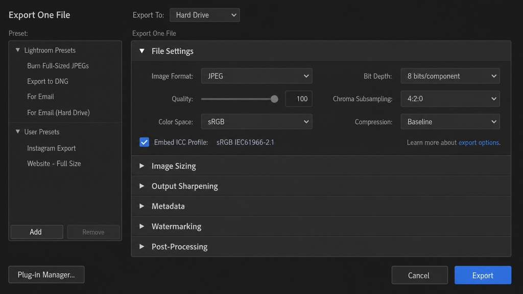
- The Golden Rule of Exporting: Force Convert to sRGB
When exporting from Lightroom or Photoshop for web or mobile viewing, set **Color Space to sRGB** and ensure **”Embed ICC Profile”** is checked. - Use Soft Proofing During Editing
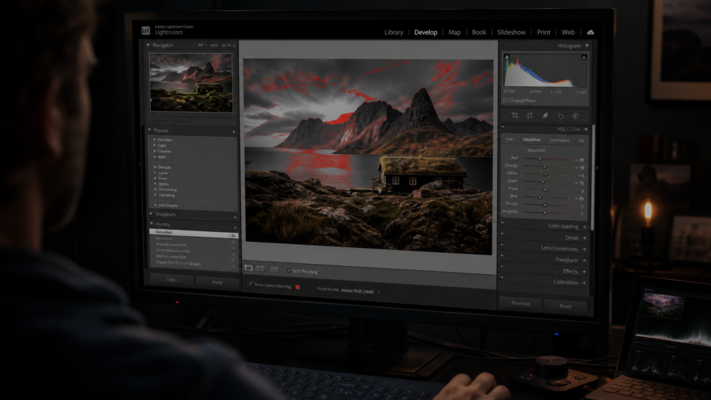
Press S in Lightroom to enable Soft Proofing set to sRGB. The software highlights out-of-gamut colors, allowing you to make targeted saturation adjustments before exporting. - Disable True Tone and Night Shift on Mobile Devices
When reviewing final deliverables on an iPhone or iPad, disable True Tone and Night Shift. True Tone automatically warms the screen based on ambient tungsten light, faking a color shift. - Calibrate Monitors Periodically
Use a hardware colorimeter (such as Calibrite or Spyder) to calibrate editing displays to industry standards (e.g., 120 cd/m², Gamma 2.2), ensuring your editing starting point is objectively accurate.
Summary:
Color management is not mystical art—it is the digital cornerstone of consistency in commercial post-production. Displays, devices, and platform algorithms fluctuate constantly, but executing proper color space conversions and embedding ICC profiles serves as armor for your images. Mastering the movement between sRGB, Adobe RGB, and Display P3 is more than a technical skill; it is the ultimate safeguard protecting a photographer’s creative vision and color dignity across the digital realm.