

Why Has Hollywood Gone All In on Teal & Orange?

Pause any modern Hollywood blockbuster from the last twenty years on almost any frame, and there’s a good chance you’ll see the same color formula: shadows and backgrounds pushed toward a cool blue-green, while skin tones, explosions, and sunset light are pushed toward a saturated orange. Transformers looks like this. The Fast & Furious franchise looks like this. So does half the Marvel Cinematic Universe. This style — nicknamed “the Netflix look” or “the Hollywood default” — is our first topic: Teal & Orange.
And once you start talking about color, gear enthusiasts inevitably end up talking about the glass itself. So our second topic digs into something even stranger: why do certain legendary lenses from the Cold War era slowly turn yellow on their own over the decades? The answer involves radioactivity — as in, actual nuclear physics.
Part One: Teal & Orange — A Color Formula That Feels Like Cheating
1. The Principle: Vectorscopes and the “Skin Tone Line”
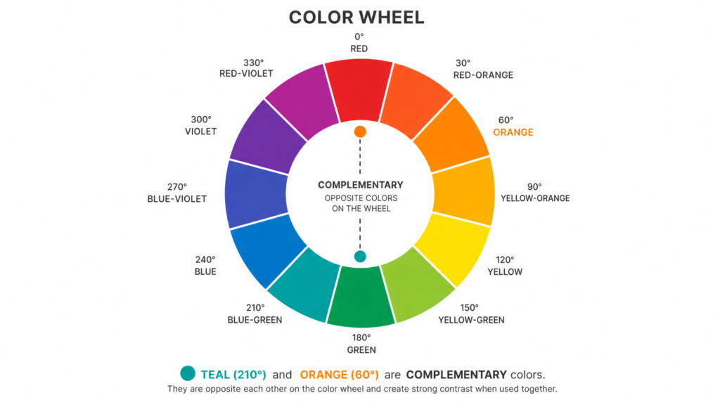
At its core, teal-and-orange grading relies on one of the most basic ideas in color theory: complementary contrast. On the color wheel, teal (a blue-green) sits almost directly opposite orange. Placing the two side by side creates the strongest visual contrast the eye can perceive.
The hardcore technical reason is hidden in post-production software: On a Vectorscope in grading tools like DaVinci Resolve, regardless of a person’s race or ethnicity, human skin tones universally fall along a specific axis known as the “Skin Tone Line” (an orange vector). Therefore, the most mathematically logical way for a colorist to separate the actor’s face from the background is to push the environment toward the exact opposite of this axis—teal. This helps audiences instantly know where to look during visually dense action sequences.
2. From Film Stock to the Digital Grading Suite
Using complementary colors to create emotional contrast isn’t a digital-era invention. As early as the 1940s, legendary cinematographer Jack Cardiff was already using similar warm-cool contrast techniques in Technicolor films like Black Narcissus.
But teal-and-orange only became an industry-wide default once digital color grading matured. It’s widely credited to colorist Stefan Sonnenfeld, who popularized a bold version of the look on Michael Bay’s Bad Boys II (2003). The commercial success of Transformers then convinced the industry that this “expensive-looking” quality could be replicated as a formula. With the rise of DaVinci Resolve and pre-built LUTs, teal-and-orange becoming the “default aesthetic” was almost inevitable.
3. Overused, and Now the Target of Backlash
Any formula that works too well eventually starts to feel cheap. In recent years, teal-and-orange has drifted from “elevated cinematic quality” to something critics increasingly mock, arguing that it flattens the distinct color identity of films. That’s why some directors (such as in certain A24 productions) have deliberately pushed back with more restrained, natural grading as an aesthetic rebellion.
Part Two: Thorium in the Glass — A Nuclear Physics Footnote Baked Into Vintage Lenses
Having covered post-production color, let’s turn to the lens itself — because decades before digital grading suites existed, optical engineers were already manipulating color through far more extreme means: mixing radioactive elements directly into the glass.

1. Why Put Thorium in Glass in the First Place?
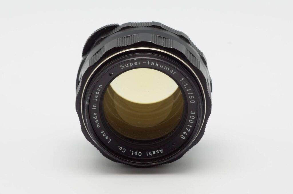
From the 1950s through the 1970s, optical manufacturers chased two goals: a higher refractive index and lower chromatic dispersion. Glass formulators discovered that adding rare-earth oxides — particularly thorium dioxide (ThO₂) — pushed both metrics closer to the ideal. Manufacturers used “thoriated glass” in high-end lenses, with famous examples being the Pentax Super Takumar 50mm f/1.4 and the Kodak Aero Ektar. Thorium happens to be a naturally radioactive element that undergoes slow alpha decay.
2. That Yellow Tint Is Literally Radiation Written Into the Glass
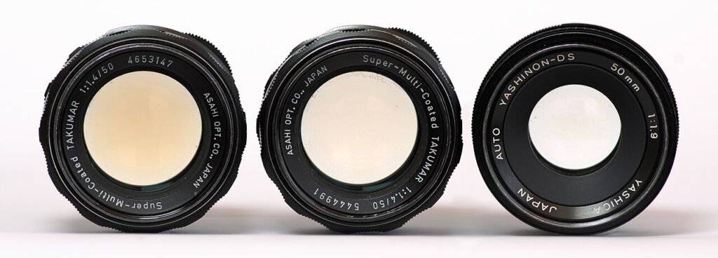
If you’ve picked up a vintage Takumar 50mm f/1.4, you’ve probably noticed a yellow-brown tint. The real culprit is the ongoing decay of thorium. Alpha particles continuously strike the glass lattice, creating “F-centers” (crystal lattice defects). These defects change how the glass transmits light, causing it to gradually yellow and darken.
Interestingly, this process is reversible: exposing the lens to strong ultraviolet light (like leaving it on a sunny windowsill) can rearrange those color centers and restore clarity. This is the science behind the “sun-bleaching” trick.
3. Is It Actually Dangerous to Own and Use These Lenses?
For everyday use, the risk is extremely low — but not nonexistent.
- The real concern arises if these elements are shattered or ground into powder. Inhaled dust poses a severe internal radiation risk. The consensus: normal collecting is fine, but never disassemble or grind the glass.
- Thorium emits radiation via alpha decay. Alpha particles have weak penetrating power and can be stopped by a single sheet of paper or dead skin cells. Normal shooting poses negligible external exposure.
Part Three: Two Kinds of “Aging,” One Shared Aesthetic Logic
Digital colorists push images toward teal-orange contrast in pursuit of a “premium” look, while optical engineers decades earlier added thorium to glass in pursuit of cutting-edge resolution. Time played a joke on both: those once-cutting-edge radioactive lenses now carry a naturally warm, retro yellow cast — precisely the “film look” modern photographers deliberately chase.
Reflections
Every value a colorist types into a grading panel, and every gram of thorium an engineer added to a glass formula, was aimed at the same goal: making the image sharper and more striking. Yet time turns “state of the art” into “a signature style.” Today, we pay premiums for the radioactive yellowing of vintage lenses and apply digital Teal & Orange LUTs to chase the authenticity of imperfection. Ultimately, color is not just an aesthetic choice, but a visual record of technological history.